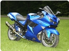
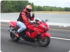
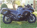
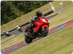
i been playing around with photoshop trying to come up with a nice paint scheme, and this is what i came up with...any opinions?
 |
 |
 |
 |
 |
 |
 |
Created on: 05/12/12 07:32 PM
Replies: 16
lschevy
Joined: 02/19/10
Posts: 133
scottfarm
Joined: 04/22/10
Posts: 84
lschevy
Joined: 02/19/10
Posts: 133
KoflaOlivieri
Location:
Joined: 02/17/12
Posts: 1805
Rook
Joined: 03/28/09
Posts: 21241
RE: playing with photoshop
05/12/12 9:50 PM
you can't miss with painted grills.
The typeface is too big and IMO that one is too generic too gimicky. I would try cap N and lower case inja. Definitely try italicized .....perhaps an easier to read font and exagerated slant to convety speed. I like kanjis but what you have is too big.
1" high type is very easy to read from 40-50 feet. It does not need to be that big if you are thinking people won't be able to see it.
zxinit
Location: Greenville TX
Joined: 07/18/09
Posts: 309
KoflaOlivieri
Location:
Joined: 02/17/12
Posts: 1805
cjuni
Location: Title Town MA
Joined: 06/12/11
Posts: 297
lschevy
Joined: 02/19/10
Posts: 133
smokinstorm
Location: OBX, NC
Joined: 03/18/12
Posts: 87
RE: playing with photoshop
05/17/12 9:41 PM
Maybe it's just me but I love the all black murdered out look. Those red graphics just don't look right on such a nice paint job. BTW, who painted it and how much $$$? I just bought another 14, red, and really want it black.
lschevy
Joined: 02/19/10
Posts: 133
Rook
Joined: 03/28/09
Posts: 21241
RE: playing with photoshop
05/18/12 12:48 PM
'Ninja" type is much better. I'd try cuttong the kanjis to half that size or less. Also remember this is a pic of the bikes shadow side. the graphics would be a bit darker than what you are showing..
* Last updated by: Rook on 5/18/2012 @ 12:48 PM *
lschevy
Joined: 02/19/10
Posts: 133
Rook
Joined: 03/28/09
Posts: 21241
RE: playing with photoshop
05/18/12 5:10 PM
HMMM? the tank cover? I would only put the Ninja logo there if it was very small. That would be unique and leave a less cluttered looking scheme.
IMO, you do not need to have everything maxed out on size. Establishing priority by having a variety of sized conveys your ideas but is good and it also avoids the unpleasant effect of the elements competing for attention.
* Last updated by: Rook on 5/18/2012 @ 5:11 PM *
lschevy
Joined: 02/19/10
Posts: 133
Rook
Joined: 03/28/09
Posts: 21241
soulshaker
Location: nj
Joined: 01/23/12
Posts: 27
New Post
Please login to post a response.


